13. Check out the website
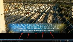
The text directing customers to the AAA Daily Fuel Gauge Online report indicates the wrong website address. This is not due to a spelling error, but rather, the person responsible for completing it forgot to consult it.

14. Elevator Panel
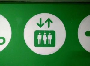
The logo of this elevator sign has a glaring error. The white lines on the top of people’s heads look like ropes. Death is the last thing you want to think about when you get shot 20 stories in a little metal box.

15. Enter at your own risk
Brodie Food Mart had a partial panel failure. It converted their name into something a little more worrisome-sounding. This is the kind of sign one would expect to see in a post-apocalyptic world.

16. Injured Platypus
This tea ball is platypus shaped. It looks like a cute design, at least until the first time you use it. That’s when you realize that the tea that goes through the holes looks like blood that flows.


