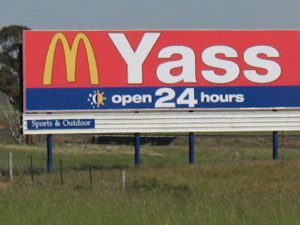
5. Open 24 hours
This sign is for a McDonald’s in the town of Yass, but the person who positioned the “M” before the Yass didn’t really think about it. When placed in this order, it reads a little differently.
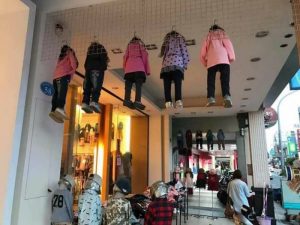
6. Horror in Shopping Malls
Hanging mannequins from the ceiling seems like a good idea in theory. This allows greater visibility of the display and does not waste ground space. However, from the wrong angle, it seems that several girls were hanged by the neck.
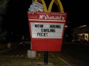
7. Apply now
A bad letter was all it took on this outdoor McDonald’s panel to completely change the meaning. The spelling error reminded passers-by that the restaurant was hiring pieces of poop instead of smiling.
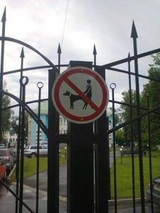
8. No Doggie Style
Just about anything could happen under that red line. The view is blocked, so who knows what the man and dog are doing. But the original image was very healthy, we’re sure. It’s just hard to say now.

